March 5, 2021. Quite a bit of effort went into the visual design of this campaign website, so I thought I’d share five key elements that drove what you see here.
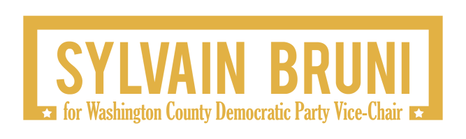
(1) The logo embodies key ‘personality traits,’ which reflect my vision of politics: purposeful and direct, simple yet professional, clear without distractions. The mark seeks to project stability and resilience, with stature.
(2) The typography marries the capitalized, sans-serif Bebas font, which echoes the mark values, with the compressed, serif Gloucester font, which contributes an official touch and grounded anchor to the design. The corresponding webfonts are Oswald and Vollkorn, respectively.
(3) The palette combines a reddish-brown with a deep yellow, as references to the rurality of Washington County and the sun that bathes Appalachia. Those reflect my experience as a newcomer to northeast Tennessee, with a wink to my French heritage: I indeed refer to the color scheme as Mustard on Bordeaux!
(4) The imagery focuses on me, of course, as a new candidate-what’s-his-face, as well as symbolic photography, to illustrate my core values.
(5) The layout purports to carry on the traits embodied by the logo: keeping it sleek and straightforward, focused on the essential.
Thoughts? Reach out to me!
-sylvain
